We'll work on making an element interactive from best case scenario, where you have anchors to work with, to worst case, where you're working with raster images (eg. png and jpeg) or any non vector graphic. By the end of this post you will be equipped with the techniques and mental models for dealing with interactivity on the frontend.
Best case scenario
If you've ever added an event listener to a button you're already well equipped for this. In the best case scenario, you have a well structured SVG which has markup similar to what you're already comfortable with in HTML. The chances of this happening are not very high though. Most SVG illustrations you find online may have some grouping and labelling, although they may not be for the purposes you seek.
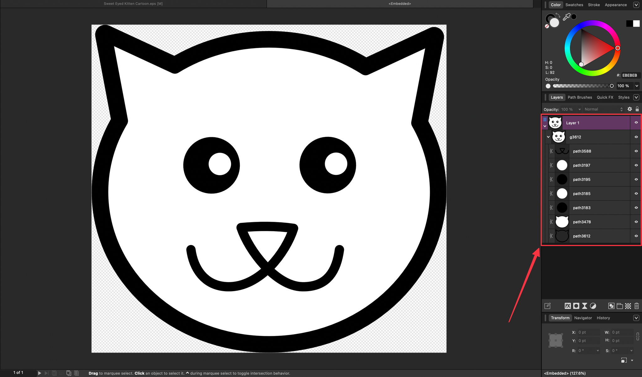
This is what the content of this SVG for a cat's face looks like. In template form it would look something like this
<svg>
    <path id="path3612" />
    <path id="path3478" />
    ...
</svg>
How do you know which path is the left eye? Or which path represents the nose and mouth? Looks like even the best case is not straightforward after all.
What makes this best is that, since you have HTML elements for different parts of the illustration, you can attach events to individual parts of the image. If you are comfortable with design tools, you can import the SVG and group the elements and name them how you want. That way you can put events on things like
<svg>
    <g id="left-eye">
        <path id="path3612" />
        <path id="path3478" />
    </g>
    <g id="right-eye">
        <path id="path3612" />
        <path id="path3478" />
    </g>
</svg>
In the best case scenario your designer does this for you. This is a lukewarm scenario because we got an SVG but we had to prepare it by ourselves.
Now you can add a click event handler to the left eye, right eye or any other labelled part. A use case would be a children's app where they click on a part and you say the name of the part.
Worst case scenario
This is the main goal of this post where we'll dive into techniques that will have you moving like Neo in the Matrix with interactivity problems.
In the worst case, you're not working with vector based graphics but raster images. Raster images are made up of equally sized cells known as pixels. Most of the images you see daily are all raster images. If you zoom in close enough you see individual colored squares.
When using these in HTML you add an img tag. This gives us no opportunity to add interactivity to specific points how we did with SVGs.
So what can we do?
The solution
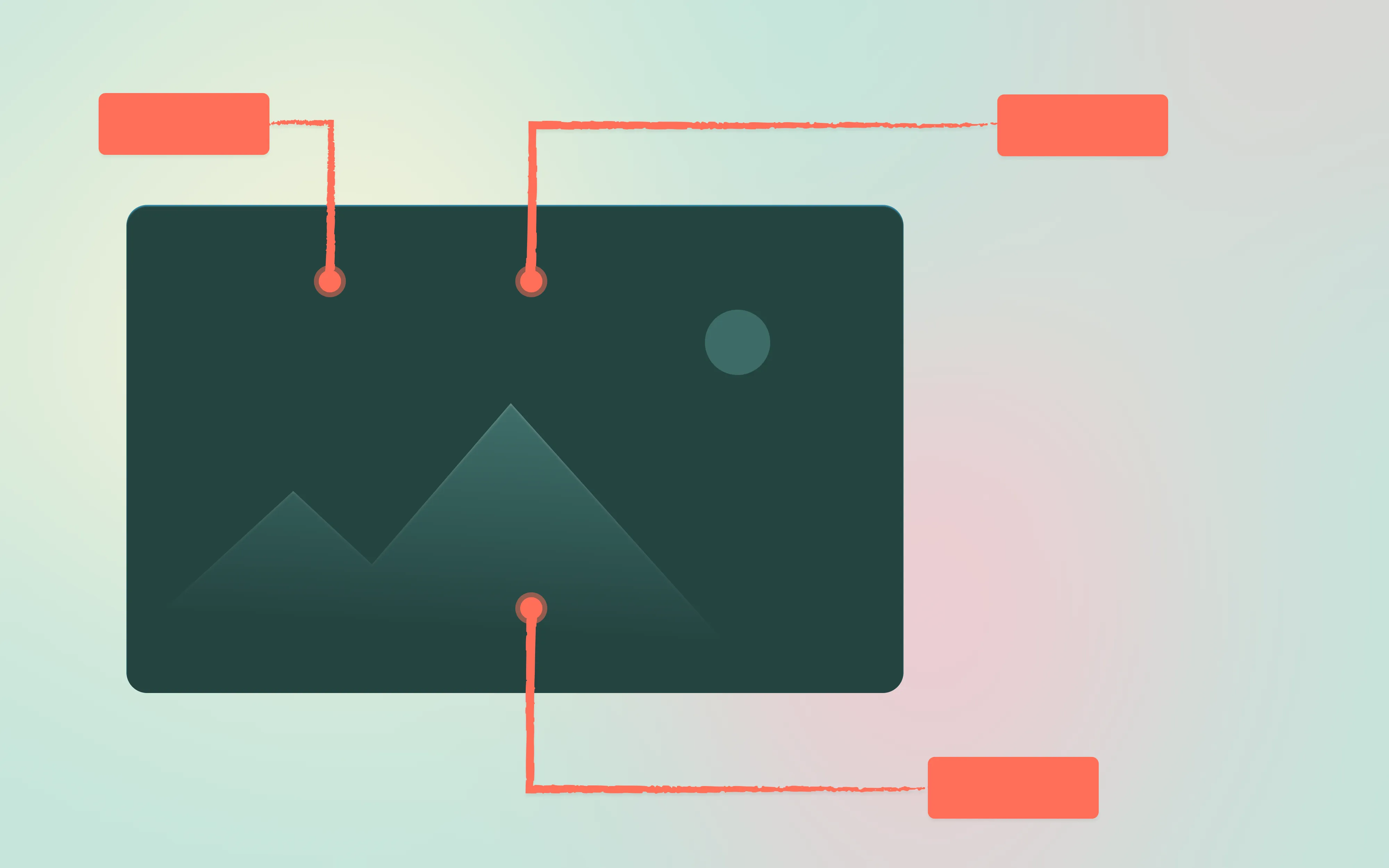
We'll have to invent the points to attach an event. We'll employ relative and absolute positioning to help us do this. It will look something like this:
<div id="wrapper" class="relative">
    <img src="someimage.png" />

    <div id="left-eye" class="absolute size-8" style="top:242px;left:291px;" />
</div>
A couple of things to note:
absolutepositioning tells the browser to calculate an element's position relative to the bounds of the closest parent element withrelativepositioning. You most likely know this already.- The wrapper element takes the dimensions of the
imgelement. We set it to use the width of its content so it doesn't grow past the image width when the environment allows it. The height will by default use the content as reference.
If you're using Figma this is how you can find the position of points. Create any shape on top of your image. While the shape is selected, press and hold alt or option on mac and move your mouse pointer over the reference image. That should give you the pixel position.
Now you can repeat this to add interactivity points to your non vector images.
Pixel value pitfall
There's something wrong with this approach and I hope your frontend senses are tingling. Using pixel values for the positioning means the points will be off when the image size changes to meet responsiveness needs.
We can resolve this by using percentage values to position the points. We can get that by (target / full size) * 100. For vertical calculations full size represents the height and width for horizontal calculations.
The illustration's dimensions in the video is 760 x 705
So left is (242 / 760) * 100 = 31.84% and top is (291 / 705) * 100 = 41.28%
<div id="wrapper" class="relative w-max">
    <img src="someimage.png" />

    <div id="left-eye" class="absolute size-8" style="top:31.84%;left:41.28%;" />
</div>
Here's an implementation with percentage values
This is okay for the most part but we're not done yet.
Centering the anchor
Let's say we want the interactive area to be larger. Open the CSS tab in the CodePen above and change the width and height to 110px. You end up with results like this:
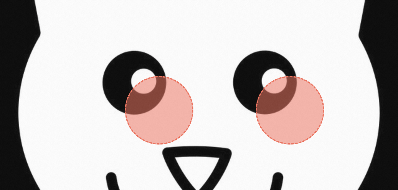
This is because the browser applies the position we provide relative to the bounds of elements.
Subtracting element position
To make the center of the anchor match our coordinates perfectly, we need to "shift" it back the direction we're applying (left, top) by the distance from the anchor's bounds to its center. This is just width / 2 and height / 2, so 55 for both. In order to know what percentage to subtract from the existing values we need to find the 55 in terms of the dimensions of the illustration.
There are some nuances to take note of here:
- The size of the anchor is in pixels. This is intentional to explore this area of consideration. In practice you might make it responsive as well but with a min width so it's not inaccessible on smaller screens.
- This means the percentage to subtract will change whenever the size of the illustration changes. Because 55 / 760 ≠ 55 / 500.
- So the percentage has to be calculated dynamically.
Using negative transform values (preferred)
This approach involves using translate transformation to shift the anchor back into position. ie. negative half of its width in both x and y direction. This is simpler than the approach above that requires you to know about the parent's current dimensions. This is the result:
You can adjust the size variable in the CSS and see how the middle is aligned with the defined top/left coordinates.
Summary
We covered a lot of ground. We went from labelling well structured SVGs, to inventing our own anchor points on raster images, to handling the positioning pitfalls that come with responsiveness. The key techniques were converting pixel positions to percentages and using negative transforms to center the anchors.
Some of these techniques will come in handy beyond what we covered here. Stay tuned for more posts like this.